

Excel is one of the most powerful tools for managing and analyzing data, but numbers alone can sometimes feel overwhelming. That’s where charts come in. Knowing how to create a chart in Excel step by step can turn raw data into clear visuals that help you tell a story, identify trends, and make better decisions.
Whether you’re a student preparing a project, a business professional creating reports, or just someone who loves organizing data, mastering Excel charts will make your work easier and more impactful. In this guide, we’ll walk through everything you need to know — from inserting your first chart to customizing it like a pro.
Why Use Charts in Excel?
Charts in Excel are essential because they:
-
Present data visually for quick understanding.
-
Highlight trends and patterns at a glance.
-
Make reports and presentations more professional.
-
Allow comparisons between multiple data points.
-
Simplify decision-making for businesses and individuals.
Complete Tutorial: Creating a Chart in Excel Made Easy
We’ll walk through each step so you can confidently build your first chart.
Step 1: Prepare Your Data
Ensure your dataset is neatly structured before adding a chart.
Tips for preparing data:
-
Use column headers (e.g., Month, Sales, Profit).
-
Avoid blank rows or unnecessary formatting.
-
Keep numeric values in columns, not scattered.
Example Table:
| Month | Sales ($) | Profit ($) |
|---|---|---|
| January | 10,000 | 3,000 |
| February | 12,500 | 4,200 |
| March | 14,000 | 4,800 |
Step 2: Select the Data Range
-
Click and drag to select the cells containing your data, including headers.
-
For the example above, select A1:C4.
Step 3: Insert a Chart
-
Open the Insert tab from the Excel ribbon to access chart options.
-
In the Charts group, choose the chart type you want (Column, Line, Pie, Bar, etc.).
-
Select the chart style you prefer, and Excel will generate it instantly.
👉 Pro Tip: If you’re unsure which chart suits your data, use Recommended Charts under the Insert tab.
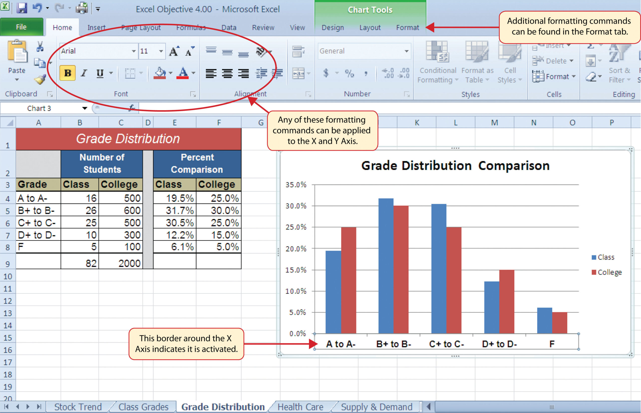
Step 4: Customize the Chart

Once your chart appears, you can customize it:
-
Add Chart Title: Double-click on the default title to rename it.
-
To modify the chart’s appearance, go to Chart Tools → Design → Change Chart Type.
-
Customize colors by selecting Chart Tools → Format and exploring style options.
-
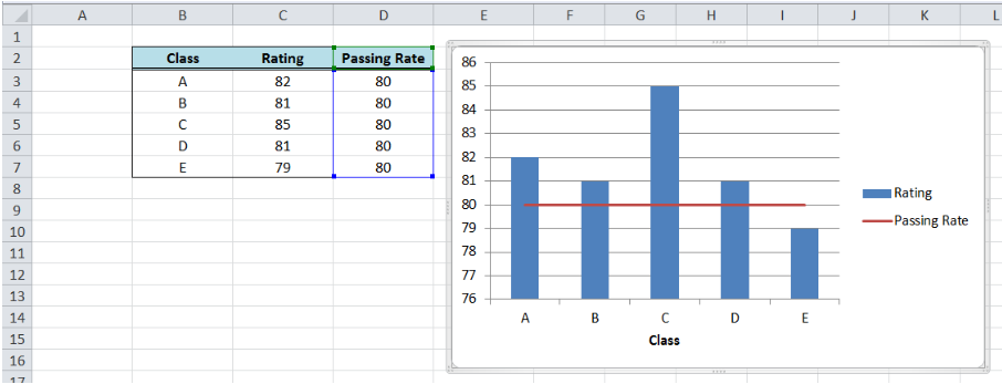
For better understanding, add data labels by right-clicking a data point and selecting Add Data Labels.
- Use Legends: Toggle on/off legends for clarity.
Step 5: Format the Chart for Better Presentation
A good chart isn’t just about data—it’s about readability.
Formatting Tips:
Keep colors simple and consistent.
Avoid 3D charts unless necessary (they can distort values).
Use gridlines sparingly.
Use a simple, readable font size for titles and labels to ensure clarity.
Different Types of Charts in Excel
Excel offers many chart types. Choosing the right one depends on your data.
| Chart Type | Best Used For | Example Use Case |
|---|---|---|
| Column Chart | Comparing values across categories | Monthly sales comparison |
| Line Chart | Showing trends over time | Stock price movement |
| Pie Chart | Showing proportions | Market share |
| Bar Chart | Comparing multiple items | Survey results |
| Area Chart | Displaying volume trends | Website traffic |
| Scatter Chart | Correlation between two variables | Height vs. weight analysis |
👉 External Resource: Microsoft Excel Chart Types
Advanced Chart Features in Excel
After mastering the basics of creating a chart in Excel, try these advanced options:
1. Combo Charts
Combine two chart types in one (e.g., column + line) for deeper insights.
2. Secondary Axis
When data ranges differ, add a secondary axis for accurate comparison.
3. Sparklines
Insert small, cell-level charts for quick trend visualization.
4. Pivot Charts
Create charts from PivotTables for interactive reporting.
Common Mistakes to Avoid
Using too many colors or effects.
Choosing the wrong chart type for the data.
Cluttering the chart with unnecessary labels.
Forgetting to update charts when data changes.
FAQs
Q1. What is the easiest way to create a chart in Excel?
Simply select your data → Go to Insert → Recommended Charts → Pick a chart → Customize it.
Q2. How can I make my chart update automatically when the data changes?
If your chart is linked to a table or range, Excel updates it automatically when the data is modified.
Q3. How do I move a chart created in Excel over to Word or PowerPoint?
Yes, you can. Simply right-click the chart, choose Copy, and then Paste it into Word or PowerPoint.
Q4. Which chart type is most effective for highlighting trends?
A Line Chart works best to visualize changes and trends over time.
Q5. Can I create a chart from multiple sheets in Excel?
Yes. Use the Select Data Source option to include data from different sheets.
Conclusion
Learning how to create a chart in Excel step by step is one of the most useful skills you can master. Charts not only make your data easier to understand but also make your reports more professional and engaging.
Start with simple column or line charts, then explore advanced features like combo charts and PivotCharts as you gain confidence.
If you found this guide useful, explore more Excel tutorials such as PivotTables in Excel or How to Format Cells in Excel to further boost your skills.
Ready to turn your data into visuals? Open Excel today and create your first chart!

